The three components I had to consider while working on these were:
1. Sailing (don't ask me why)
2. Reality( homes for now but may move to commercial)
3. "Green" ( the word of the year )
My favorite design was this:
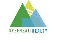
 The client wanted something a bit abstract, and I thought this had just the right amount of abstraction showing trees, sails, and the sharp angles of buildings.
Along with this I created a file with about 4 other designs to show the client( which I may or may not post at a later date)
Today heard back that yay, the client liked all my sketches! As always though, there were a few "little touch ups" which I worked on today and sent back to Karen.
As far as my favorite design went, it was not the client's favorite( the one that I thought would be her favorite in fact was, but I'm not going to address that design in this entry...)
Regarding my favorite, the client believed it too closely resembled a regatta. I do not completely disagree with this, though I personally think the regatta feeling does not outweigh the tree or building, but I am not the client so who cares what I think : )
Anywho, I like where this ended up going anyways. I morphed everything keeping a similar shape turning the logo into almost a landscape, with a house in the front, tree behind it, and mountain/sail in the background.
 So fingers crossed for this design, but I think if she goes with any of mine it will probably be the one she currently favors, possibly because of the gradients...
No comments:
Post a Comment